Saturday 1 August 2015

Moving on

Morning! We have really enjoyed hosting this blog but have made the decision to move to our Facebook group in the hope that we can have more chat and participation. We hope you have enjoyed reading and will join us here for continued inspiration. If you feel that you would prefer to stick with the blog format please do let us know in the commentsxxx

Friday 31 July 2015

Super sixty

 I took a white card and decided to use it as a top fold then I layered two shades of green & embossed a piece of white card on the top half only, placing a plain piece at the bottom. I then took several paper flowers and stacked them on top, tucking a piece of cream vinyl ribbon underneath them. I added adhesive pearls to the centres of the small flowers and a small Whimsies flower to the centre of the large flower. As the card is for my sisters 60th birthday, I then added the number 60 on it too.
Elaine

Thursday 30 July 2015

Cabin fever


The colour palette this week of the pale greens and yellows really resonated with a recent photo taken on a school trip. We were staying in lovely wooden cabins by a beautiful creek and when we arrived the sun was shining (sadly it didn't stay that way for the whole trip) and the spring leaves and the new grass were the most gorgeous colour. This page is a tribute tot he fact not everything has to be new and on trend ... old stash works too. The background cardstock is actually a mottled greeny-beige and is from a pack I bought when I first started scrapping in 2003.. I added two clusters of embellishments, keeping the tones matching those of the photos. I dredged out some very very old Prima leaves and an even older journaling block sticker that I think dates back about 10 years. The corner decorations are from my favourite stamp set that I use on so many of my layouts and cards and I have no idea who made it or where it was from - it's another that dates back years. The two strips of patterned papers are off cuts from free papers from a Scrapbook magazine from about 2007 and the butterflies were from a freebie pack of stickers I won in a competition and as I haven't entered a competition in years and year it makes them old too. As you can see, I believe in making my stash work - no matter how old it might be.
Karen

Wednesday 29 July 2015

Simple thoughts

 I spend ages making cards sometimes but there are occasions when you need something quick and so simple but effective is the order of the day. This was a five minute card made to say thank you to a friend who did something thoughtful. I used a pale lemon/cream card, die cut two swirls, two flowers and a butterfly and added them straight on to the card. I added a simple stamped sentiment, mounted to match and finished the flowers and butterflies with a few seed beads. It really was very quick but a nice personal way to say thank you. Sometimes I feel we over-think things and try and make them more complicated than necessary. Sometimes simple works well.
Karen x

Tuesday 28 July 2015

Monday 27 July 2015

Sew clever


When I saw this colour scheme it put me in mind of some fabric remnants I had found in the bargain bin of my local fabric shop. Combined with the cream twill and mink outer, it made the perfect contrast fabric for this little gadget bag, which I now use for all of my basic sewing supplies. I definitely think I'll be making a few more of these!
Leanne

Sunday 26 July 2015

A beautiful page


When I saw the colour scheme for this it had a sort of ethereal quality and I knew just what I wanted to create. The photo is of a friend's daughter and the digital papers and embellishments were all created by Fanette Designs at Pickleberrypop. I used the same photo twice but the larger picture is blended in with the background. I also used brushes to blend the images and enable the picture at the front to pop out.
Karen x

Tuesday 21 July 2015
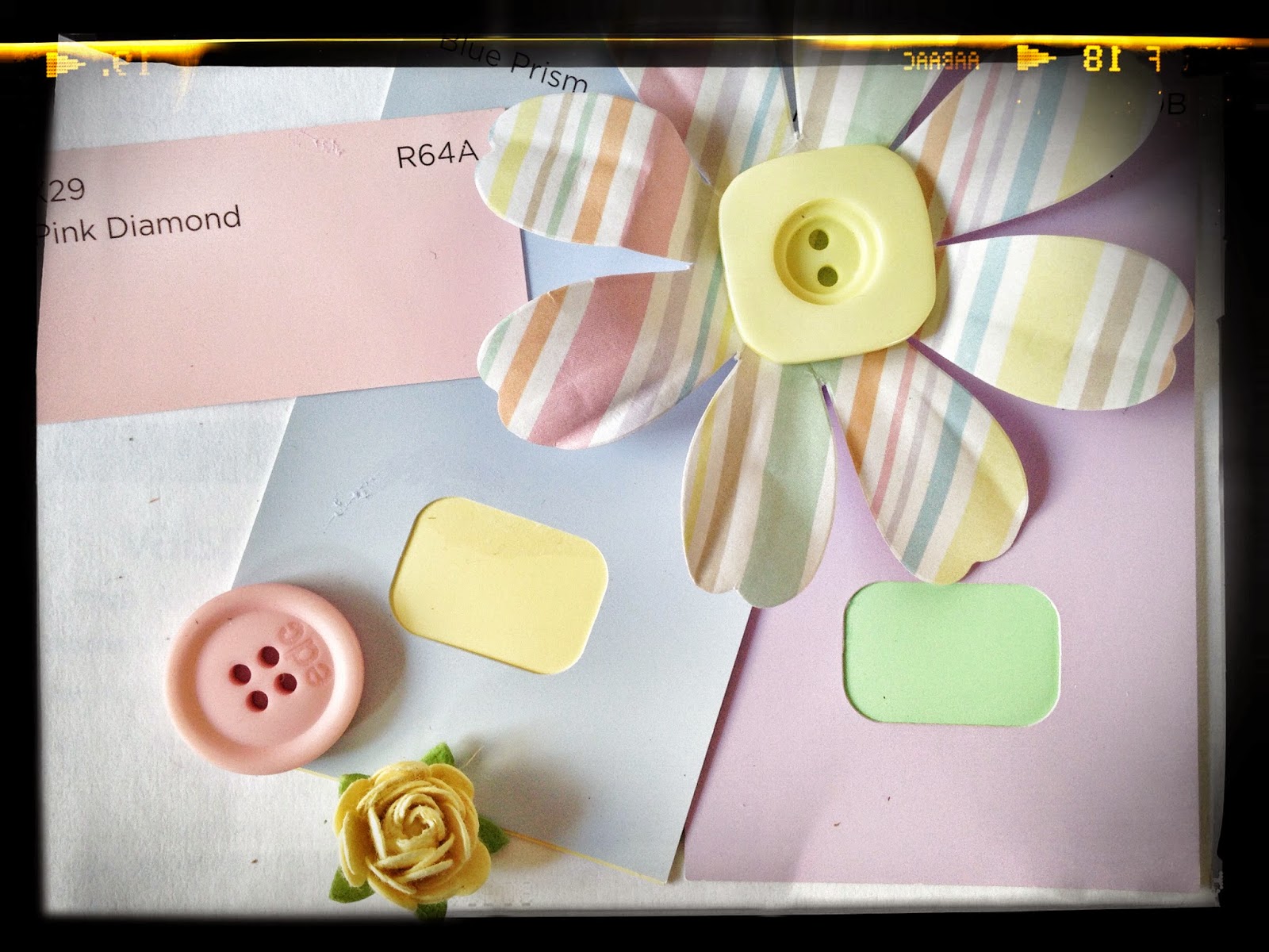
Picture perfect

I  took a sheet of spotty bazill CS and stamped Stampin up 'Gorgeous Grunge' splatters all over it. I then layered Carta Bella Baby Mine collection papers and I punched several hearts and layered them adding pearls and a little lace for extra dimension. I then added foam Thickers baby shapes and topped off with tiny pastel buttons. I then finished it off with a tiny title..Picture Perfect.
Elaine

Monday 20 July 2015

Rabbit card

Hi everyone, another week and another colour combination for you to play along with. This week we have pastel pink, green and lemon, a perfect combination for a baby card. To start with I have cut a C6 card landscape, I then used my Papertrey ink dies to cut out a pastel green frame, the white stitched frame and the internal vellum, Cuddly friends by K & Company. I layered the frames together also taking the oval out of the card so that the light shines through the vellum. I have then added a coordinating organza bow. The wee tag and stamps are also by Papertrey ink and I have stitched it to the bow with pale green thread. Finally I rounded all the outside edges to go with the rounded edges theme. I hope you enjoy this weeks colour combination, happy crafting folks, regards Erika.

Sunday 19 July 2015

Joy

I took a sheet of flock CS and layered it on a white background after first punching some border strips from it. I then matted the photos on pink card. I used two scraps from my stash for the layers behind the photo collection and punched bunting from more scraps. I then added the flower and some strips of heart paper behind the photos and set the bunting on some bakers twine. I added the pink chevron paperclip and flower and finished with a smattering of glitter glue.
Elaine

Thursday 16 July 2015

Friendship card

Hello again, this weeks colour combo is brown, green, orange and neutrals. This is not normally a combination I would work with but I love a challenge. To start with I made a C6 card with a side fold. I have to fully admit this was an idea recently shared by the lovely ladies over at Papertrey ink. http://nicholeheady.typepad.com/capture_the_moment/ The idea being to die cut an image and then colour it with your preferred medium. I have used Papertrey ink cover plate In the Woods with my copic markers. Direct to the card I have stamped the image about friendship from Indigoblu Enjoy life. I have then added distress ink Spiced marmalade, Rusty hinge and Vintage photo around the sentiment starting with the lightest and working out. I have then added the frame with 3d foam to the card and finally places half a dozen orange embellishments to finish. I hope you enjoy this colour combination this week, happy crafting, regards Erika.

Monday 13 July 2015

Steampunk style


Here is a male birthday card with a steampunkish feel about it. First I took a piece of white card and rubbed Prima Dark Rust ink along the edges. I then matted with some white cardstock. On top of that I used a piece of crisp tissue paper from a chocolate box (I ate the chocolates!). Then I put a piece of vinyl ribbon on top of the tissue and added a piece of beige cardstock that I put three small candi dots on. I then added two cogs and added pearls for rivets. I then added the copper effect car sticker and finished it off with the sentiment which was stamped using Happiest Birthday Wishes, a hostess gift, from Stampin Up.

Elaine

Sunday 12 July 2015

Marmite moment


Everyone knows I have crazy cats and Fiki is the craziest of all. He has an addiction to Marmite and marmite crisps in particular. I was lucky enough to catch him with the packet stuck on his head. As soon as I saw this colour scheme I knew it was Fiki colours with the mahogany tones and the green like his eyes. I used lots of scraps of browns and greens and creams for the page and added some stickers and flowers. I edged the strips in faux stitching and added a journalling block.
Karen xx

Friday 10 July 2015

Thinking of you

Good morning, back again with another shades of green card this time CAS (clean and simple style). I am loving this less is more approach to card making just now, with lots of white card, creating a clean and refreshing feel. To create this card I have made a C6 card with a top fold. I have then used Stamping up set Gorgeous grunge and Distress inks Crushed olive and Peeled paint together with SU inks Old olive and Garden green to create the splashes. I have then inked with black archival the diagonal lines from the same stamp set and the sentiment by Hero Arts Great flourishes messages. Finally adding five clear pearls to finish. I hope you have fun with this colour combination. Thank you for joining us again today and happy crafting, regards Erika.

Thursday 9 July 2015

Green Wedding

 Hi. It's Caz here with a little inspiration rather than a project.
Since my husband admitted his favourite colour was green (how did we get to 15years without me knowing that??) I have a new appreciation for the colour. Sadly it's not one I took much
notice of but as soon as I saw this weeks colour scheme I was reminded of this beautiful Italian inspired wedding and the table centre pieces which are so unusual.
I know notice how nature really does offer up a truly magical colour pallet when we take the time to really look.

Wednesday 8 July 2015

Dreamy card

Good morning and this weeks challenge is shades of green, one of my favourite colours, calm and relaxing. For this card I have first created a 6" square card and a 5" frame for my card in white, 1" in depth. Then I stamped it with Stampers Anonymous Botanical sketch and Distress ink Crushed olive. I used the technique second generation stamping which sounds very technical but basically just means you ink the rubber as normal but the first stamp is on scrap paper and the second is on your finished work. It just gives a lighter imprint and is subtler for a background. I then used my blending tool to add more Crushed olive ink and then Peeled paint distress ink around the edges. The sentiment is stamped direct to the card and is by Indigo blue Enjoy life. I have then added three punched daisy's with green confetti, to match the sentiment. I hope you enjoy this weeks colour challenge, more from me again soon, happy crafting, Erika.

Sunday 5 July 2015

A card trio


A very quick share of three cards to the theme. A quiet week ahead but we hope you find inspiration here!
Laura

Wednesday 1 July 2015

Reflection

 'Sometimes with the busy papers, it's hard to think of inventive ways to use them. Believe it or not I'd actually cut the 'wavy' border to start with, but realised it wasn't particularly even. So I continued to use a blade to cut off the excess which created a sliver of paper - and that's where the wavy pieces of paper came from. I continued to cut away at the square I'd cut to create further, adhered them to the paper. Then adhered the wavy border. A few punched hearts and a matted photo were added. Together with a stamped title. The muted purples worked really well with the candlelit picture taken in a mirror! So next time you trim those papers and have those off cuts that would normally end up in the scraps bin, see if you can use them in a creative and fun way! - Happy Scrapping Catch Ya Later - Virginia'

Tuesday 30 June 2015

Purple journal


This is my post. The best colour in the whole world is the one that looks good on you. I recently attended a Kate Crane workshop where we made some brayered backgrounds. I had previously attended a whimsical faces workshop and combined the two to make this journal page. I used acrylic paints and stamps and some gelli prints for the dress.
Debbie x

Monday 29 June 2015

Box clever


 I bought a very cheap little wooden box for £1 that had three drawers. I wanted it to tone in with the other boxes on my desk so I painted it with warm white acryllic pain and then used a Tim Holtz stencil flourish and Victorian Velvet Tim Holtz distress ink to decorate the sides and top. I added some die cut butterflies with gems for centres and made some roses and leaves - just wanted to keep it simple.
Karen xx

Sunday 28 June 2015

Paint pot

Here is my paint brush pot that I made out of a cocoa tin. I started with covering it with gesso, added Paper Artsy chalk paint, them added pink tissue paper and finally added one ply of a pretty cocktail napkin, all sealed with PVA glue and a final layer of gesso to tone down the darker purple. I then made a cluster of Prima paper roses on a white leaf, one large lilac rose, one smaller purple one, a white one and a very small green bud with a couple of pearl trims.
Elaine xx

Friday 26 June 2015

What have you been doing?

Did this weeks scheme appeal to you? What did you do? We'd love to see!

Thursday 25 June 2015

It's been a bit quiet

As you may have noticed, there's been less posting this week. We have tried to keep up with posting daily where possible but it's not always been possible. We hope you are still enjoying the blog and popping in for posts we hope inspire xxx

Tuesday 23 June 2015

Hugs and kisses

Here is an anniversary card I made using a Martha Stewart punch anywhere on the page heart punch. I then placed paint chips behind the hearts and used a little glitter glue over the top of them. I then stamped the sentiment using Stampin Up Good Greetings stamp set. I matted the white card on a piece of backing card that I ahead painted using Docrafts blush pearl acrylic paint. Finally I finished with three pearls.
Elaine

Sunday 21 June 2015

A perfect picture


 I took a white sheet of plain CS and added a scrap of polka dot pink paper. I then added a strip of pastel yellow on the top half. I cut several banners from colour paint chips and added them below the photo that I had matted on pinky coloured paper. I then lightly stamped some butterflies on the background and used a lid to make the larger circles and an ink dauber to make the smaller ones. I used Stampin ups Gorgeous Grunge to add 'splashes'. I then used the Stampin up banner punch to cut the tiny banners on the right of the photo and added some pastel buttons and stuck it onto some pink bakers twine. I also used the paint chips to cut the large butterflies and used various coloured pearls to finish them off.

Friday 19 June 2015

Fruity flowers


Not just a bowl of fruit has these zesty colours! Head out to your gardens for inspiration!

Thursday 18 June 2015

Simple beauty

Good morning, here is my take on this weeks colour combination "citrus shades." First I have stamped a flower from Stampers Anonymous Flower Garden with Archival ink. I have then used my distress inks to watercolours the image; I have used Squeezed lemonade, Mustard seed, Spiced marmalade, Peeled paint and Crushed olive. Atter allowing the image to dry I layered on corresponding orange card stock. Direct to the card I have then used The crafters workshop stencil Mini chicken wire reverse to create a background using Spiced marmalade. I have then stamped the sentiment on to cream card, again Stampers Anonymous Perspective, coloured with marmalade and layered onto orange cardstock before adding to the card. To finish I have added a bow with cream string on the flower. CAS! That's all from me today, I hope you enjoy this weeks fresh colour combination. Regards Erika.

Wednesday 17 June 2015

Win win on the stash


Well one sheet of yellow cardstock, three sheets of patterned paper, a heart punch, a quote, a corner punch and a couple of ready made embellishments and we are done. I created the layout with relative ease, border punching the yellow cardstock, strip of paper over he top, corner punching the photo and cardstock behind, tearing the paper around the edge and adding the journal block and title. Photo taken of a local English Heritage property with a beautiful garden. This left me with a pile of scraps, not enough to warrant another layout but certainly enough to create a few cards and the positives with this that given the paper choice I'd opted for the cards will be appropriate for male as well as females when it comes to birthdays - so a complete win win! How's your scrapping going lovely people? Catch ya later Virginia

Tuesday 16 June 2015

Zesty cards


Thought I'd share a few zesty cards for the scheme this week! Hope you like!
Laura